
Your bedroom and bathroom don’t need to match exactly—they need to coordinate thoughtfully. I’d start with a shared color palette using two or three analogous colors like blue-green and blue for natural flow.
Repeat textures like wood finishes or shiplap, then coordinate your hardware finishes (matte black, brass, or brushed nickel) across both spaces.
Add bold accents through affordable items like throw pillows or framed art in one signature color.
This approach creates harmony while letting each room keep its own personality—and there’s plenty more strategy to discover.
Do Your Bedroom and Bathroom Actually Need to Match?
Why do we assume our bedroom and bathroom have to be twins? They don’t. Your spaces can create cohesion without matching perfectly. I’ve learned that shared elements—like consistent finishes and a limited color palette—connect rooms naturally without requiring identical furniture.
Think of it this way: you’re building a personal retreat, not a showroom. A warm bedroom can pair beautifully with a spa-like bathroom. Both spaces feel planned and unified through thoughtful design choices, not duplication.
The approach is balance. Use complementary colors, similar hardware, and coordinating textures across both rooms. This lets each space develop its own mood while maintaining harmony throughout your personal retreat. You’re creating transition with purpose, not constraint.
The Design Difference Between Matching and Coordinating
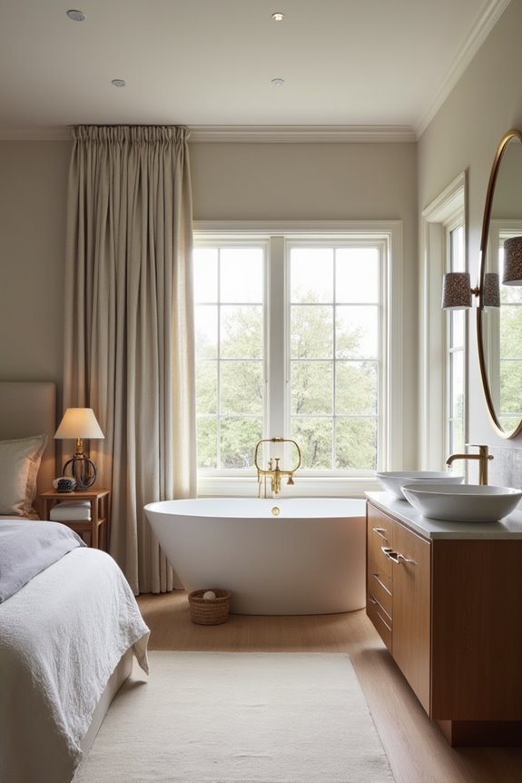
When I talk about matching versus coordinating, I’m really describing two distinct design approaches that create very different results in your spaces. Matching means you’re duplicating elements exactly—same colors, same finishes, same objects—while coordinating uses related but not identical features to build harmony without the monotony. I’ve found that coordination actually gives you more creative freedom; you can share a color palette or consistent hardware finishes between your bedroom and bathroom while letting each room maintain its own personality and function.
Coordination Creates Visual Harmony
you don’t actually need them to look identical to feel connected. Instead, embrace coordination—a design strategy that creates visual harmony while respecting each space’s unique purpose.
Think of it like this: a shared color palette ties your rooms together beautifully without demanding identical furniture or decor. You might repeat a soft blue accent wall in your bedroom’s throw pillows, then echo it through bathroom towels and artwork. This approach establishes a cohesive connection between spaces.
The real benefit happens when you use contrasting elements purposefully. Recurrent materials—say, natural wood or brushed nickel hardware—connect your rooms while allowing each space to maintain its distinct personality and function.
Matching Requires Identical Elements
While coordination gives you creative freedom, matching takes the opposite approach—it demands that you use the exact same elements in both your bedroom and bathroom. You’ll replicate paint colors, furniture pieces, and hardware with precision across both spaces, creating mirror-like symmetry that appears deliberate and unified.
This strategy builds cohesion through sameness rather than thoughtful pairing. Every finish, texture, and accessory must align perfectly—a 2-inch brushed nickel drawer pull in your bedroom needs its identical twin in your bathroom vanity.
However, this rigid approach sacrifices flexibility. Individual room needs get overlooked when you’re committed to uniformity. Plus, if design trends shift, you’re stuck updating both spaces simultaneously. That neutral base you liked last year? You’ll change it everywhere at once.
Choose a Cohesive Color Palette as Your Foundation
I’d recommend starting with two or three main colors that’ll tie your bedroom and bathroom together smoothly. Using analogous colors—those neighbors sitting right next to each other on the color wheel—creates that soft, blended transition you’re probably imagining between the two spaces. These foundational colors become your guide for everything from wall paint to fixtures, making the whole design feel deliberate and considered.
Analogous Colors for Flow
The approach to seamless bedroom-and-bathroom coordination involves choosing colors that naturally belong together. Analogous colors—hues sitting next to each other on the color wheel—create flow between spaces. This method avoids jarring contrasts that make rooms feel disconnected.
When you select three adjacent colors like blue-green, blue, and blue-violet, you’re building a design that works well together. Carry these tones through walls, textiles, and accessories for unified visual harmony.
Why analogous colors work:
- Create natural, harmonious transitions
- Establish balanced, sophisticated aesthetics
- Avoid disjointed, clashing appearances
- Blend softly across connected spaces
- Build a thoughtfully connected home
Avoid opposite-spectrum hues—they’ll undermine your flow. This strategy works by connecting your bedroom and bathroom into spaces that belong together, creating the unified look you’re seeking.
Neutrals: Timeless and Adaptable
If analogous colors feel too limiting for your style, neutrals offer a solid foundation for connecting your bedroom and bathroom. Cream, gray, white, or greige create cohesive spaces without demanding constant decorating decisions.
You can start with a neutral palette on large surfaces—walls, flooring, fixtures—then layer in bold accents through affordable decor items whenever you’re ready. This approach gives you freedom to evolve your style without renovation costs.
Consider using two shades within the same neutral to define different zones while maintaining harmony. Layered textures matter too. Stone tile, wood elements, and soft fabrics work well against neutral backgrounds, creating the calm you’re seeking.
Your coordinated suite becomes timeless and yours.
Repeat Textures and Materials Across Both Spaces
Matching textures between your bedroom and bathroom creates a visual bridge that ties both rooms together without relying on color alone. Repeating specific textures and textiles throughout connected spaces builds cohesion in a natural way.
Repeating textures throughout connected spaces builds natural cohesion between rooms without relying on color alone.
Consider these textural elements:
- Wood finishes on furniture pieces in both rooms
- Shag rugs or tapestry curtains for visual continuity
- Shiplap or similar wall treatments
- Matching wall-hanging frames and art motifs
- Marble or complementary surface materials
Coordinate Hardware and Fixture Finishes Intentionally
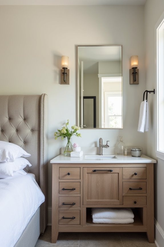
Have you ever noticed how mismatched cabinet pulls and faucets can make even a beautifully decorated room feel scattered? Choosing cohesive finishes creates a unified retreat across connected spaces.
Select one primary metal tone—matte black, brushed brass, or aged bronze—and repeat it across faucets, cabinet pulls, towel bars, and light fixtures. This consistency strengthens the connection between rooms without requiring identical pieces.
Pair your finishes strategically: matte black hardware complements white or gray surfaces beautifully, while brushed brass glows against dark wood. For subtle depth, consider mixing within the same family—brushed brass with antique gold creates richness while maintaining harmony.
Include lighting fixtures in your coordination. Choose similarly styled lamps and overhead lights that echo your hardware’s finish, reinforcing the design throughout both spaces.
Tie Rooms Together With a Shared Design Theme
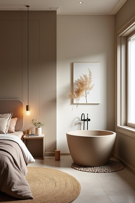
I’ve found that the most polished bedrooms and bathrooms share something deeper than matching paint colors—they tell the same visual story. When you choose cohesive design elements like natural wood finishes or repeating textures such as shag rugs and shiplap, you’re creating a thread that runs through both spaces. These shared materials and patterns work like visual anchors, making your rooms feel designed with purpose rather than randomly decorated.
Cohesive Design Elements Matter
When you step from your bedroom into your bathroom, you shouldn’t feel like you’ve walked into a completely different home. Creating a cohesive design means your spaces flow naturally together through intentional choices. Establishing a shared color palette anchors everything well.
Consider these connecting elements:
- Natural wood finishes on furniture and fixtures
- Repeated textures like shag rugs or shiplap
- Matching wall hangings or art themes
- Shared collections (seashells, vintage vases)
- Neutral base colors with subtle accents
A cream or greige foundation works well in both rooms. Layer in coordinating accent colors—perhaps soft blues or warm taupes—to maintain visual harmony. This approach doesn’t require matching everything identically. Instead, you’re creating a design language that whispers consistency throughout your personal spaces, making your home feel deliberately designed rather than randomly decorated.
Repeating Textures And Materials
Why do some bedrooms and bathrooms feel organically connected while others seem worlds apart? Repeating textures and materials across both spaces creates that missing link. When you deliberately echo bedroom bathroom textures, you’re building a visual conversation between rooms.
I recommend starting with shared materials like natural wood finishes on furniture or shiplap on walls. Woven rugs, linen curtains, and tapestries work beautifully in both spaces. Even matching frame styles for artwork reinforces unity without relying on identical colors.
The approach requires balancing consistency with variation. Use matte, satin, and gloss finishes strategically so each room maintains its own identity while staying connected through your chosen design theme.
| Texture Type | Bedroom Application | Bathroom Application |
|---|---|---|
| Wood | Nightstands, headboards | Vanity, shelving |
| Linen | Curtains, bedding | Shower curtains, towels |
| Shiplap | Accent walls | Wall panels |
| Woven | Area rugs | Bath mats |
| Metal Frames | Art displays | Mirror surrounds |
Use Neutral Tones on Large Surfaces for Flexibility
How’s this for a design strategy: pick neutral colors for your biggest surfaces, then build everything else around them? Cream, gray, white, or greige walls create the perfect backdrop for any style you love. This approach works well for coordinating your bedroom and bathroom together.
Here’s why I recommend this method:
- Neutral bases coordinate various fixtures without clashing
- You’ll easily match textures like stone tile and wood
- Color and pattern stand out in smaller accents
- Your spaces feel connected yet individually styled
- Changes become affordable and simple to execute
When you establish neutral tones on large surfaces, you’re giving yourself permission to experiment. Your walls won’t fight your bold art or colorful textiles. Instead, they’ll support whatever personality you want to express. This flexibility means your spaces grow with you, making coordination between rooms feel natural and planned.
Bring in Bolder Colors Through Small, Affordable Accents
Now that you’ve got your neutral foundation in place, it’s time to add personality to your spaces. I’ve found that introducing a single bold accent color—like navy, emerald, or gold—changes both rooms affordably.
Start with budget updates using throw pillows, towels, vases, and framed art in your chosen shade. These small pieces create consistent decor by repeating your accent color strategically across the bedroom and bathroom.
I recommend placing your bold color in three key spots: a feature towel rack, a framed print, and a decorative tray. This approach creates visual ties between rooms while maintaining that calm, spa-like feel.
The benefit? You’re investing in affordable accents rather than expensive renovations. Your bold color choice finally gets the attention it deserves.
Align Lighting Fixtures for a Unified Atmosphere
When you’re connecting your bedroom and bathroom, matching your lighting fixtures is one of the quickest ways to tie everything together visually. Choosing the same metal finish—whether that’s matte black, brass, or brushed nickel—makes both spaces feel deliberate and well-planned rather than mismatched. By coordinating your fixture styles, hardware details, and color temperatures (ideally around 2700–3000K for warm lighting), you’ll create a primary suite with smooth transitions from one room to the next.
Matching Fixture Finishes Across Rooms
Because lighting fixtures anchor the visual design of any space, I’d recommend treating them as the connective tissue between your bedroom and bathroom.
When you select finishes for your fixtures, you’re creating visual cohesion that makes both rooms feel deliberate and connected. I’ve found that choosing one primary finish—matte black, brushed gold, or chrome—creates a unified suite.
Here’s what I’d prioritize:
- Match all sconce finishes in both rooms for visual harmony
- Coordinate ceiling fixture styles to share similar scale and silhouette
- Align pendant lights with the same metallic tone throughout
- Mirror hardware finishes on cabinets and mirrors for consistency
- Repeat accent materials like glass or wood across fixtures
Your fixtures don’t need to be identical. Instead, they should speak the same visual language. This approach creates the sense of belonging you’re seeking—a suite that was deliberately designed rather than randomly assembled.
Creating Cohesive Ambient Lighting Design
How do you move from one room to another and feel like you’re entering a completely different world? Consistent lighting design prevents that jarring disconnect. The key is choosing a unified color temperature—I recommend 3000K to 3500K across both spaces. This warm range creates continuity while maintaining that spa-like sanctuary feeling you’re after.
I layer my ambient lighting strategically: recessed ceiling fixtures provide foundational brightness, vanity lighting handles tasks, and accent lamps soften edges. Dimmable options let me adjust the atmosphere instantly, shifting from energizing mornings to relaxing evenings without switching rooms.
When your bedroom and bathroom share matching metal finishes and complementary fixture styles, they speak the same design language. You’ll notice how this continuity connects separate spaces into one integrated retreat.
Hardware and Accent Lighting Coordination
Your lighting fixtures are the jewelry of your rooms—they deserve to match. I’ve learned that coordinating hardware finishes creates the cohesion that connects separate spaces into one unified home.
When I select finishes, I’m intentional about consistency:
- Match all metal finishes (brushed gold, matte black) across sconces and vanity lights
- Coordinate faucet handles, drawer pulls, and towel bars with lighting metals
- Choose 2700K–3000K color temperature for warm, cohesive illumination
- Select complementary styles like modern farmhouse for both areas
- Layer lighting similarly with central fixtures plus wall accents
This approach results in your bedroom and bathroom feeling thoughtfully designed rather than randomly decorated. I’ve noticed that when hardware finishes align with lighting metals, guests recognize the careful planning immediately. You’re creating spaces that genuinely belong together.
Consider an Open Concept Layout for Seamless Flow
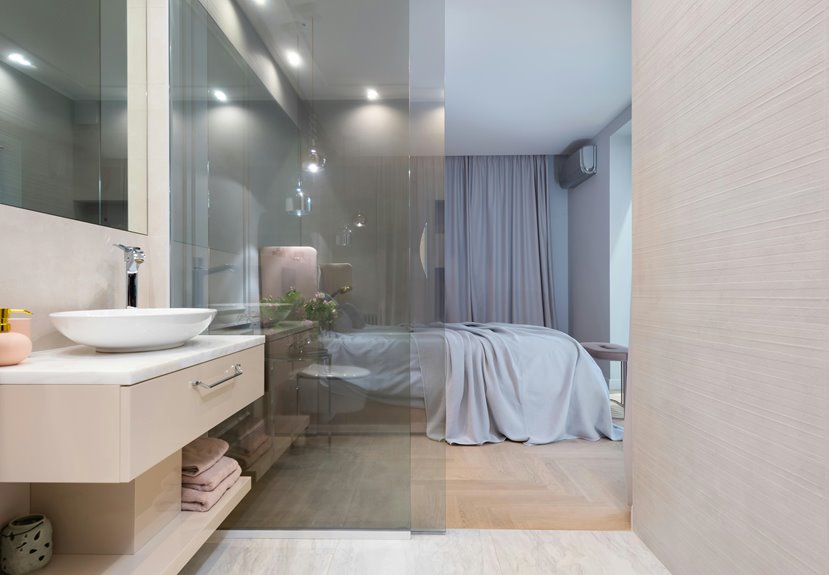
Ever notice how luxury hotel suites feel so spacious and inviting? I’ve discovered that removing non-load-bearing walls connects your bedroom and bathroom into one unified area. Instead of closing yourself off, I use frosted glass partitions to maintain privacy while keeping the space visually linked.
This open layout allows natural light to circulate freely, making everything feel larger and more luxurious. The key to success? Maintain a unified color palette and matching fixtures throughout both areas. I’ve found that coordinating textures—like marble countertops with bedroom accents—creates visual continuity without sacrificing functionality.
You’ll want to balance openness with practical needs like acoustics and storage. Consider how this layout impacts resale appeal before committing. When done thoughtfully, an open concept bedroom-bathroom becomes a personal retreat.
Match Artwork and Wall Decor Without Duplicating Everything
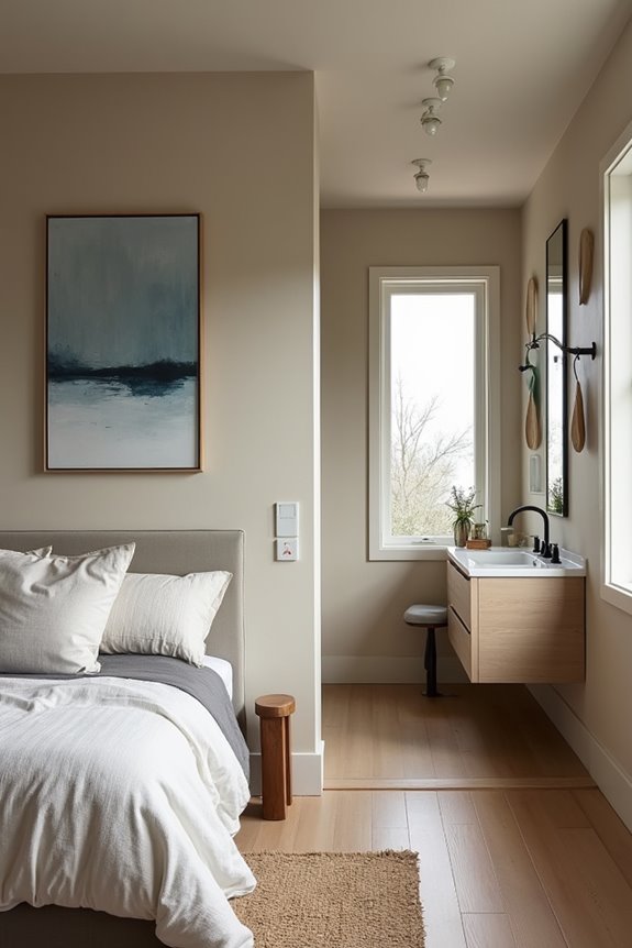
When I first connected my bedroom and bathroom visually, I made the mistake of hanging identical prints in both spaces—and it felt sterile, like a hotel chain rather than a personal retreat.
Identical prints in connected spaces feel sterile—true cohesion comes from repeating themes while varying sizes and framing.
I learned that cohesion doesn’t require duplication. Instead, I discovered that repeating a theme—like coastal imagery or florals—while varying sizes and framing creates intentional harmony. I now use a shared color accent, perhaps gold or black, threading through both rooms without matching every piece exactly.
Key strategies I’ve embraced:
- Choose complementary proportions that suit each room’s furniture
- Mirror framing and matting styles for visual consistency
- Place larger wall art above beds, smaller pieces in bathrooms
- Select artwork that reflects your personal style
- Build gallery walls with intentional spacing and balance
This approach makes my spaces feel connected yet distinctly mine—a sanctuary that truly belongs to me.
Balance Function and Style in Each Room’s Design
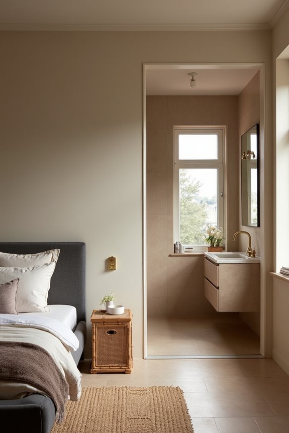
Because bedrooms and bathrooms serve completely different purposes, I’ve learned that the best design approach honors what each space actually does—while still tying them together visually.
Your bedroom needs warmth for relaxation and sleep, so I’d prioritize cozy wood tones and soft textures. Your bathroom, however, requires cooler, cleaner aesthetics that support its function. Rather than fight these differences, I embrace them within a cohesive palette.
I connect both rooms through shared hardware—matching brass or black fixtures throughout. Repeating wood finishes and metal tones creates visual continuity without duplicating features. Consider coordinating one accent element, like geometric patterns or matching tile remnants, to reinforce harmony.
This approach respects each room’s primary purpose while creating a unified design story. You’re not forcing sameness; you’re creating deliberate connections that make your spaces feel purposefully designed together.
Custom Glass Solutions to Enhance Continuity
How can a simple material like glass become your hidden asset for tying two very different rooms together?
Glass connects spaces in practical ways. It creates visual continuity while maintaining each room’s unique personality. Here’s what glass solutions offer:
- Clear or frosted partitions replace solid walls, enhancing sightlines between rooms
- Back-painted glass extends design lines and creates reflective surfaces
- Mirror installations reflect light and reinforce shared design elements
- Cabinet glass displays coordinated decor without duplicating furniture
- Hardware finishes (black, gold) align with your overall color palette
An experienced glass team helps you select materials that coordinate fixtures across both spaces. Custom glass solutions don’t just connect rooms—they establish flow and consistency. Your bedroom and bathroom become one cohesive sanctuary, unified through thoughtful material choices that work together strategically.
Common Coordination Mistakes That Create Visual Chaos
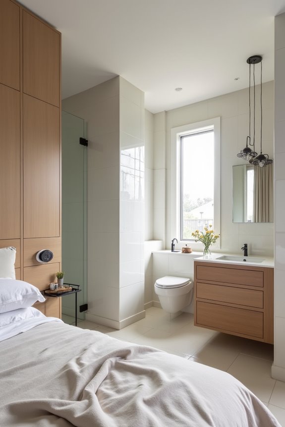
While custom glass solutions create visual bridges between your bedroom and bathroom, they’re only half the battle—the other half is avoiding design mistakes that can undo all that hard work.
I’ve seen how mismatched metal finishes—brushed nickel in one room, brass in the other—instantly break cohesion. You’ll want to commit to a single metal family throughout both spaces. Similarly, ignoring color harmony by using completely different palettes disrupts the natural flow between rooms. Instead, incorporate at least one shared color or undertone to connect them.
Don’t overload both spaces with competing patterns and textures either. Balance bold elements by repeating a few key motifs across both areas. Finally, make sure your furniture and decor reflect proportionate scales—large art paired with tiny accessories creates visual chaos rather than the unified design you’re seeking.
Create Your Coordination Action Plan
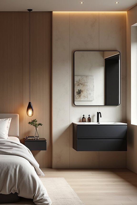
Now that you’ve learned what not to do, it’s time to build a strategic blueprint that works.
Start by identifying your shared element—maybe brass hardware or soft gray walls. This anchor ties everything together. Next, develop your color strategy using two to three main colors you’ll repeat everywhere. Think analogous shades: blues with teals, or warm grays with beiges.
Here’s your action plan:
- Map distinct zones within your bedroom-bathroom suite
- Choose consistent hardware finishes across both spaces
- Select recurring textures like wood or stone
- Designate one central motif for visual continuity
- Plan materials that appear in furniture and walls
This phased approach prevents overwhelming either room while creating that connected feeling you’re after. You’re building spaces that speak the same design language.