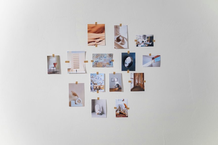
Decorating a large living room wall starts with choosing art you genuinely enjoy—bold pieces that serve as a focal point for the room. Pull your sofa 12–18 inches from the wall to create breathing room, then match your art scale to furniture size, aiming for pieces covering 2/3 to 3/4 of wall width.
Layer in floating shelves, architectural paneling, and mirrors to amplify light and depth. Consider building a gallery wall by photographing floor arrangements first. The result comes together when you combine these techniques thoughtfully, creating a space that reflects your personal story.
Start With Wall Art You Genuinely Love
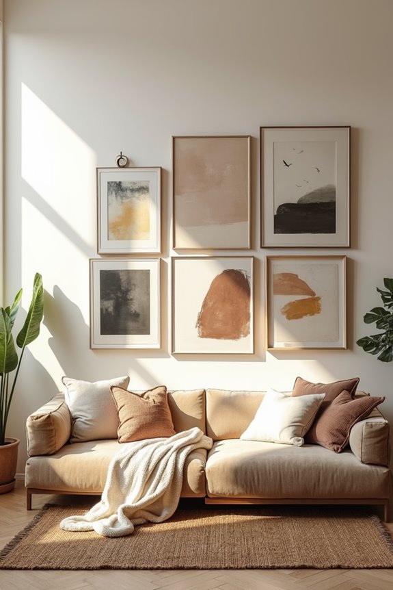
When you’re staring at a massive blank wall, it’s tempting to grab whatever artwork matches your sofa or fits the color scheme you’ve already chosen—but that’s actually backwards. Instead, begin by selecting large wall art that speaks to you. Choose bold color artwork or an oversized canvas that creates a reaction when you look at it, rather than pieces that simply coordinate with existing furniture.
This connection creates an immediate anchor for your entire room. When you lead with art you care about, everything else arranges around it naturally. Your gallery presentation becomes deliberate and personal, not forced. That’s when decorating feels less like a checklist and more like creating a space that belongs to you.
Pull Your Furniture Forward to Balance the Space
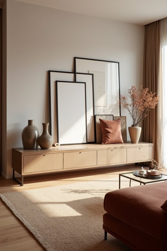
Why does pushing your sofa against the wall actually make a large room feel smaller? When furniture hugs the walls, your space loses balance and depth. Pulling seating forward creates a noticeable difference.
When furniture hugs the walls, your space loses balance and depth. Pulling seating forward creates noticeable breathing room and improves sightlines.
Here’s what I recommend:
- Move your sofa 12-18 inches from the wall to create breathing room and improve sightlines
- Position your coffee table forward to anchor the seating area and improve natural flow
- Center your oversized piece or gallery wall above the pulled-forward furniture at eye level
This arrangement prevents your large wall from feeling disconnected and floating. The negative space around your art becomes visible, allowing lighting and accessories to shine. Pair this furniture placement with a rug underneath to define your seating zone completely. Anchoring your centered artwork changes how your entire room functions and feels.
Match Wall Art Scale to Your Furniture
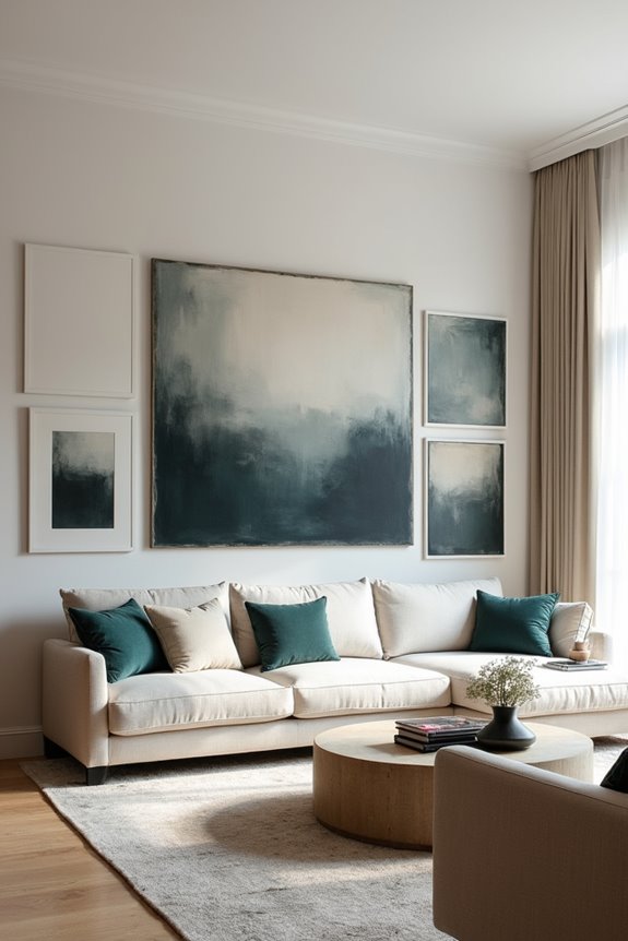
Now that you’ve pulled your furniture forward and created intentional breathing room, it’s time to choose artwork that actually fits your space. This is where wall art scale becomes your strategic advantage for balance with furniture.
For a large sofa, I’d recommend one bold, oversized art piece or two substantial prints that mirror your couch’s width. Think 2/3 to 3/4 of your wall occupied by large wall decor—this prevents that awkward, floating-frames feeling.
If you’re working with a lengthy sectional, consider a gallery or triptych arrangement. These multi-piece setups create cohesive sightlines that match your furniture’s footprint.
For deeper, bulkier pieces, opt for taller artwork to draw eyes upward, maintaining proportionality throughout your room. The goal? Your art and furniture should feel connected, not competing for attention.
Add Dimension With Shelves, Paneling, and Hangings
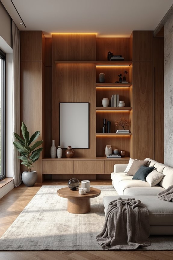
A truly dynamic wall isn’t flat—it’s got layers, texture, and things that catch your eye at different heights. Creating real depth turns an empty space into something with purpose and welcomes people into your room.
Here’s how I’d approach building dimension:
- Install floating shelves at varying heights to display books, plants, and décor that draws the eye upward and outward
- Add architectural paneling like shiplap or accent panels behind your display to introduce texture and visual interest
- Combine art hangings with picture lights or sconces to highlight pieces and create ambient depth
Balance everything with negative space. When you align key pieces along a vertical axis and make sure your furniture scale complements the wall, you’ve built a unified, layered composition that brings the whole room together.
Hang Mirrors to Amplify Light and Depth
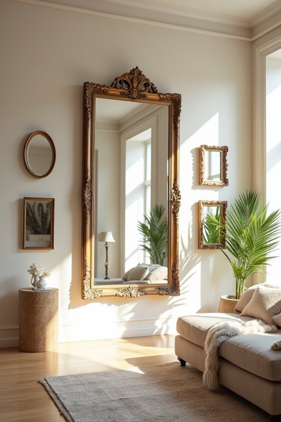
When you’re staring at a large, bare wall, a strategically placed mirror can reshape the entire room—and I’m not exaggerating. A well-positioned wall mirror doesn’t just reflect light; it amplifies it, making your space feel brighter and more expansive than it actually is.
I recommend hanging an oversized mirror opposite your window to maximize natural light distribution. This simple placement reduces perceived wall depth and creates an airy atmosphere. Pair your statement mirror with bold artwork nearby to anchor the space while the mirror does the heavy lifting.
For visual balance, try symmetrical mirror arrangements flanking your sofa. Vertically oriented mirrors above a console draw eyes upward, enhancing the room’s proportions. The result? Your large wall becomes an asset rather than a challenge, inviting guests to linger longer.
Build a Gallery Wall or Art Stack
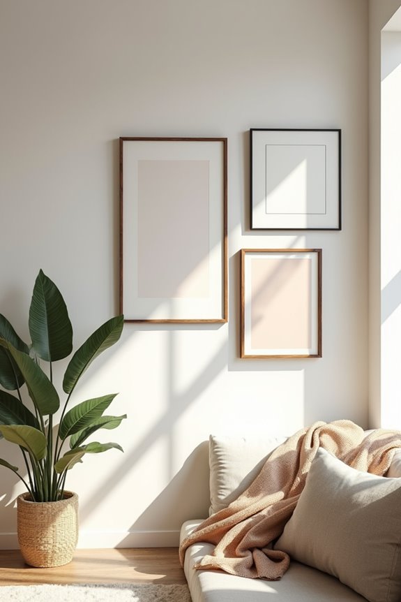
I’ve found that creating a gallery wall makes use of a large blank space as a personalized showcase of your style and interests. Before you start hammering nails, I recommend laying out your pieces on the floor—this lets you experiment with different arrangements and photograph your favorite layout so you can recreate it accurately on the wall. Whether you choose matching frames for a polished look or mix eclectic artwork for visual interest, this flexible approach means you can swap pieces whenever your taste changes.
Gallery Wall Layout Planning
How do you turn a blank wall into a display that tells your story? Thoughtful layout planning is key.
I start by outlining my wall-sized space directly on the floor with painter’s tape. Then I arrange my pieces—frames, photos, oversized pieces—before hanging anything. This approach prevents costly mistakes and lets me experiment freely.
Here’s my process for creating a cohesive display:
- Photograph your final floor arrangement for easy wall recreation
- Mix matching frames with varied mediums for visual interest
- Balance curated gallery sections with larger focal point pieces
This flexible method means I can swap pieces whenever inspiration strikes, keeping my gallery wall fresh and personal without overwhelming the space.
Art Stacking and Arrangement
Why settle for a single piece when you can create something more dynamic? I’ve discovered that stacking two to three wall art pieces with contrasting framing styles adds depth to any space. You’ll want to experiment with an eclectic vignette by mixing different shapes and sizes.
For bolder results, I position a larger centerpiece with smaller accompanying pieces around it. This asymmetry creates visual interest without crowding your wall. A gallery wall offers endless possibilities—matching frames, black-and-white photos, or completely eclectic mixes that expand to fill any space.
Here’s my process: I arrange pieces on the floor first, photograph the layout, then transfer it to the wall. This method helps with precise placement and reduces frustration during hanging.
Combine Techniques for a Curated, Layered Look
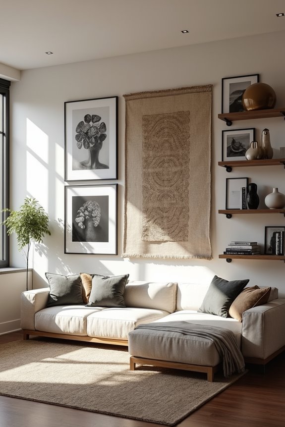
Now that you’ve got your gallery wall or art stack in place, I’ve found that mixing techniques—layering oversized art with architectural details like paneling or bold accent walls—creates visual impact without feeling chaotic. The key is balancing that large-scale focal point with your furniture placement; I pull my sofa onto a centered rug and align the art vertically above it so everything feels deliberate rather than randomly scattered. When you layer textures, lighting, and greenery around your main piece, you’re basically telling the wall a complete story instead of just hanging one lonely frame.
Layering Art and Accessories
Once you’ve chosen your wall pieces, you’re ready to move beyond single artworks and create something that’ll catch people’s attention.
Layering art and accessories turns ordinary walls into galleries. Here’s how I approach it:
- Mix your gallery wall with oversized canvases, framing variety, and complementary pieces that work together
- Add float shelves beneath artwork to display decorative objects, creating dimension and visual interest
- Incorporate picture lights above key pieces to enhance illumination and draw attention to your main artwork
The combination of these elements works best when intentional. Before hanging anything, I lay everything out on the floor and photograph the arrangement. This prevents mistakes and ensures balanced spacing. Take time with this process—your layered arrangement deserves thoughtful placement that matches your personal style.
Balancing Scale With Furniture
The real coordination happens when your wall art and room furniture work together as a unified composition. I’ve learned that large wall decor needs furniture scaled to match—not shrink your vision to fit tiny pieces. Pull that sofa away from the wall and center an oversized focal piece behind it. This creates immediate balance and makes your space feel well-planned.
Ground everything with substantial elements: a large area rug anchors the arrangement, while a console table adds weight below your art. Add strategic lighting through picture lights or floor lamps to highlight your installation without overwhelming the wall.
Think of it this way: your art shouldn’t compete with furniture—they’re teammates creating rhythm together. When scale and grounding elements align, your room becomes a carefully assembled space that reflects your own style.